
| Client | Student Project at BrainStation UX Design Program |
| Sector | Social, Entertainment |
| My Role | Entire product design from research to conception, visualization and testing |
| Project Time | 2 months (part-time) |
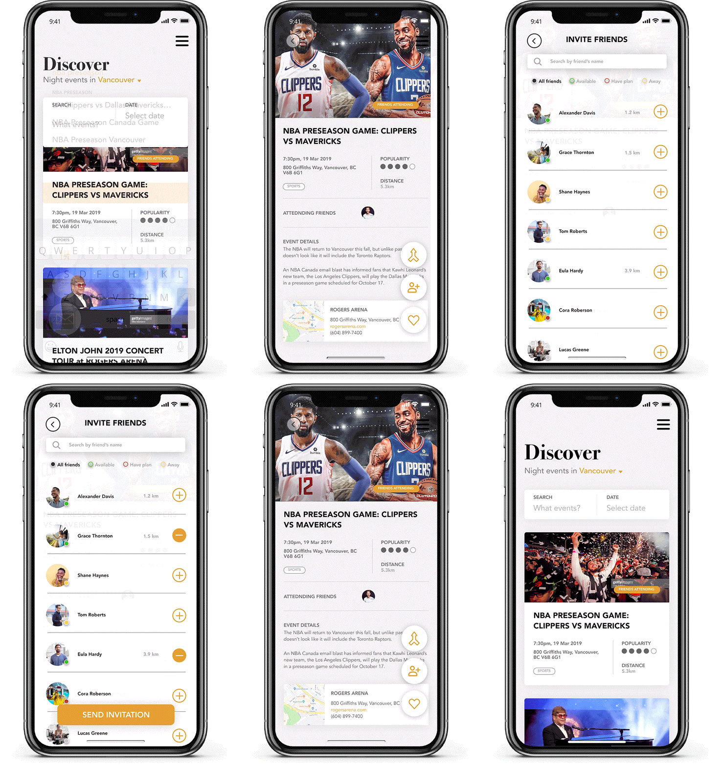
@Night is a mobile platform that enables young people to interactively and efficiently connect to a friend to attend events at the last minute. Through this mobile app, an easier approach of friends’ connection for attending events as well as an event search functionality to act is achieved.
It should be noted that I initially picked a BrainStation preset topic of Night Life of the City as my final project direction and developed the app concept base on my research. This project was accompanied by a two-month user experience design training, followed by a fixed course plan. Due to the limited timeline, I picked one aspect to focus on to develop the user experience design.
The course helped me to renew and deepen my knowledge in user experience design and to explore approaches to overcome the barriers that hinder young people from attending more events in their spare time.
Software
Adobe XD
Sketch
InVision/InVision Studio
Adobe Illustrator
Adobe Photoshop
The Problem & Initial Idea
People like to attend events, but at some time, they find an event at the very last minute. So that they cannot find friends who can go to the event together.
Also, even people know many events they have interests in, they sometimes hesitate to attend. Is there any reason behind this and can a digital product can help with this so they can attend more events?
How might we create a digital platform to provide people an efficient way to find a friend who’s willing to attend an event together at the last minute?
User Research
As one of the most important steps of product design, user research was along with the entire process, especially the early stage. It helped me understand the users from full angles and dig deep into the fact of the problem. As the user research went further, the research orientation varied base on the previous user research analysis.
The methods of user research included but not limited to interviews and surveys. Also, the user research mainly targeted to the age group of 20 – 40 years, who have daytime jobs.
Key Insights from User Research
Key Insight #1
People do LIKE to attend events, but sometimes, they find an event at the very last minute.
People like to attend events, however, for those very casual events or meetups, people don’t plan it very last, and usually at the last minute. And the last-minute invitation to a friend is not easy to be accepted.
Key Insight #2
People would hesitate to attend events if they don’t have companion.
According to the research, even people are interested in any events, if they cannot find someone they know to come together, most of them may not go.
Key Insight #3
People think TIME & DISTANCE are the two main reasons to not accept friends’ event invitation.
For people who have daytime job on the next day, even they receive invitation to an event from their friends, the time of event and the distance are considered the most whether they can accept the invitation or not.
Persona
A persona was created based on 4 key elements, goals, needs, motivations and frustrations. Not certain people with a name were created in this project (due to the limited time) but these 4 elements are the key and the main purpose of establishing a persona.
Goals
- To attend more events when get free
- To invite friends to events together
Motivations
- Would like to explore the city by attending events
- Would like to know new friends via events
- Would like to bond with friends
Needs
- Event invitation sent out be accepted
- Find out friends’ events to join in together
Frustrations
- Most invitations sent out in last-minute would easily get rejected due to the reason of the time or the distance
- Spend too much time on finding a friend to hang out together
User Flow
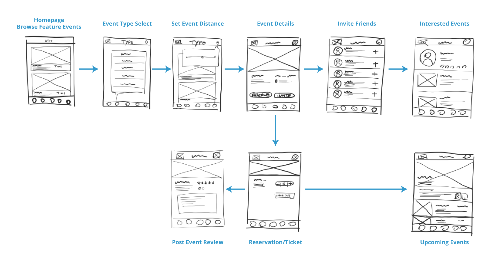
With the creation of a persona, user flow was generated to visually represent the ways how a user can take when using the app. Multiple versions of user flows were created according to the testing along the process.
Information Architecture
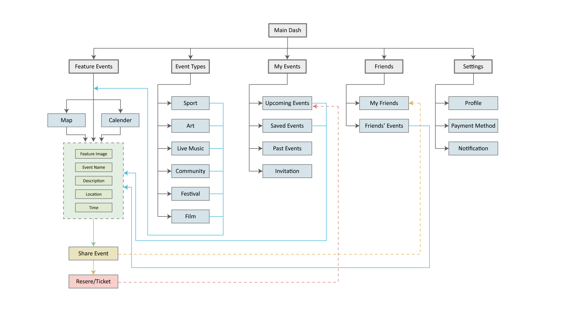
Based on the insights gained from the user research and the tested user flow, I defined the sitemap for @NIGHT and then evaluated it via tree tests with potential users.
High Fidelity Wireframe
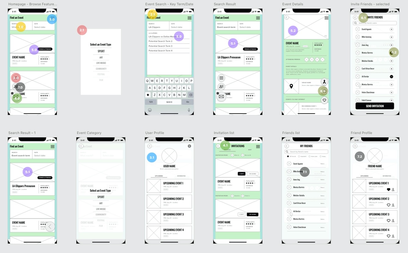
From my ideas and sketches, I created my final app wireframes with the highest resolution.
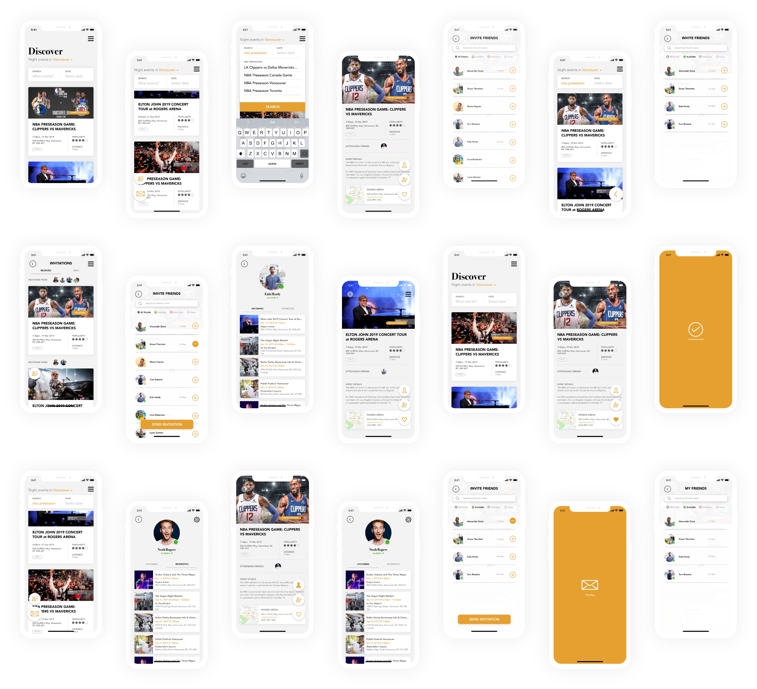
Discover Events Close-by by Browsing and Searching
At Night will show you the events around the user, so that the user can simply browse events by scrolling on the homepage. For any special events, At Night provides the search function that allows the user to enter the keywords and select a specific date for an event.
Inviting available friends to attend an event last minute has never been easier
At Night shows the friends’ availabilities and distances from the user. With the information the app provides, it allows the user to easily find available friends to attend an event together easier.
Find friends’ events and join them together
By sorting out the friend list, the user can find a friend’s events that he/she is interested in and about to attend. User can simply save the events to their own collection and join friends together.
Check the event invitation sent and received, as well as the user’s own events collection
By clicking the invitation button, the user can see the invitations he/she sent and received. On the user’s profile page, both user’s upcoming events and interested events can be found there.
What’s Next & Conclusions
It is an uncompleted project, it still has a lot of space to dig into and to improve. With the limited project time, I picked the aspect of how to help people efficiently find a friend to an event together to be my focus. However, as an event application, it still needs more functions, such as event tickets booking, personal calendar syncing, etc. Also, more user research and testing will need to be taken place to help build the app entirely.
I completed this part-time course at BrainStation in 2 months. During those 2 months, the course helped me go through the entire process of a UX project again. I’ve been in the industry for almost 5 years. With the working experience, I know a real project usually will have a budget or time limit, more or less. Going through the entire UX process again not only helped me renew my knowledge of UX but also made me rethink my previous works about further improvement.
