| Client | Revention POS |
| Sector | B2B, Restaurant |
| My Role | Branding, Information Architecture, Wireframing, Web Design |
| Project Time | 4 months |
Revention is a Point-of-Sale solution provider catered towards the restaurant industry. Their integrated solutions enable restauranteurs to control costs, increase revenue, and delight their customers with a broad range of ordering capabilities and loyalty programs. Revention selected Rand Group Digital team as their digital design & marketing partner for rebranding and rebuilding their website. I was involved in the entire project, especially for the design and web development.
Scope of Work
Branding
Visual Design
Web Design/Development
Illustration
Software
Adobe Illustrator
Adobe Photoshop
Adobe XD
Sketch
InVision
WordPress
First Glance At The Old Site
The previous version of Revention website was built in early 2000s. At first glance at the old website, it was not mobile responsive, and the visual design was outdated. The applications of typefaces and branding elements were not consistent throughout the pages.
By looking into the site, no clear designed user flow was discovered, the structure of the entire site was confusing so that the user experience was not that great. With the accumulation from over 25 years of business operation, the website contained plenty of content that needed to be optimized and reorganized. Especially, there were over 900 customer stories stored on the website without an organization solution, which could be precious treasure for building the Revention brand.
Overall, the website needed to be completely redesigned especially focusing on its UX and visual design. By implementing the competitor research and having communication with Revention, our design team addressed the following goals of improvement for the website redesign and rebuild, and another designer and I played key roles in the entire project:
- Improve the UX of the website
- Increase the conversion rate (request free demo)
- Better visual design to give a more professional look
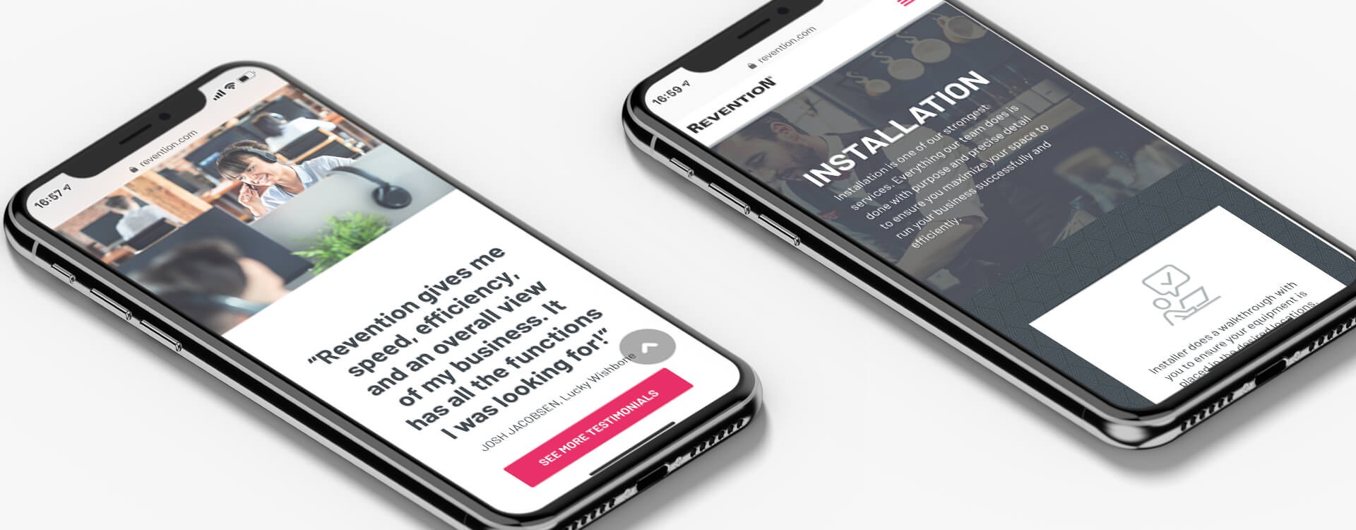
- Responsive design
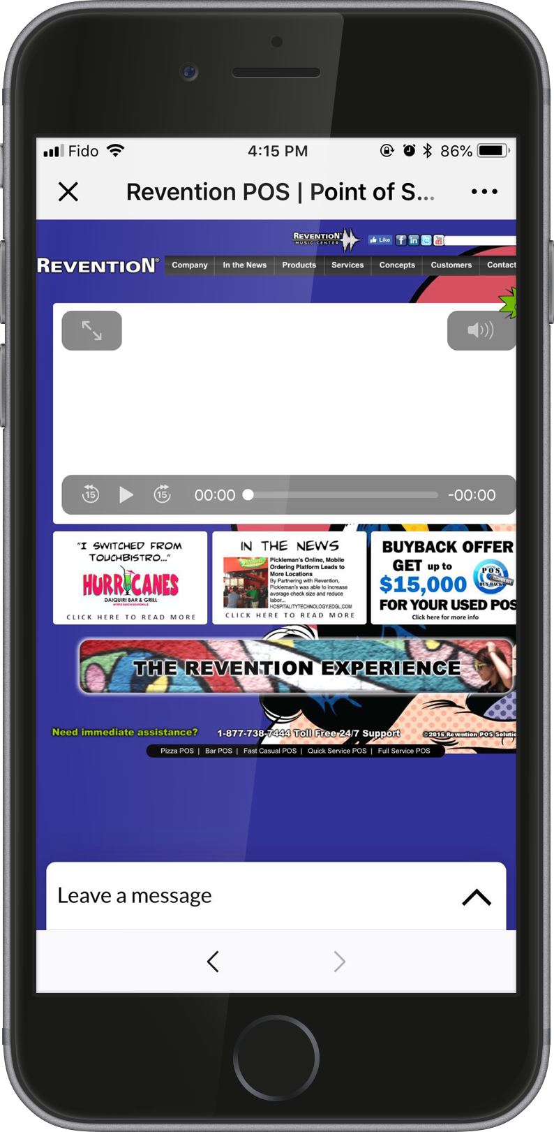
*the old site was not mobile responsive
Target Audience – Personas
The website was directed to two major groups of target audience. The first group of the target were the owners of catering business who were not satisfied with their current POS system and thinking about to switch to a new option. The second were returning clients who would like to have add-on to the existing system to archive a higher success.
Two personas were created to represent those two groups of target audience to help us implement the UX design of the website.

#1 Group of Target Audience
Full Service Restaurant Owner
GOAL(S)
- Increase the volume of guest flow
- Reduce the guest wait time for a table
- Gain more profit
NEED(S)
- More efficient table management system
- Easier order process to reduce the new hires training hours
FRUSTRATION(S)
- Find it hard to define the restaurant’s actual needs from a POS system
- The cost of switching from the old system to a new one

#2 Group of Target Audience
Fast Casual Restaurant Owner
GOAL(S)
- Upgrade the business to be online order available
- Be more reachable on multiple platforms(devices) other than a phone call to expand the business
NEED(S)
- An online ordering system add to the existing POS system
FRUSTRATION(S)
- Unfamiliar with online ordering technology
- Hard to find a consultant providing custom advice to a certain situation
Wireframe
I started wireframe as very basic black and white design, moving on to interactive designs where users can navigate between the different pages as they will be with the final website. With the feedback from the testing, more and more details were added to be Hi-fi wireframe with an optimized UX and logical website function processes.
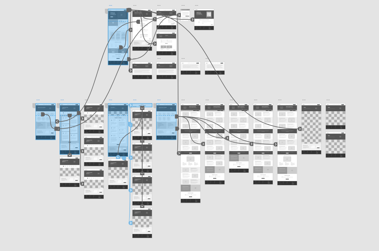
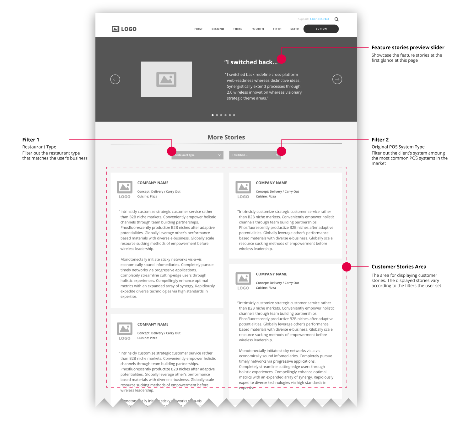
Duel Filter Function
By communicating with Revention and implementing research on Revention’s target audiences, we extracted an insight that clients like to read the success stories to resonate. It would be very persuasive to convince the potential clients to request a demo if they can find a success story that was originally suffering a similar problem.
With this info, we designed a duel filter on the testimonial page to help users sort out stories by choosing both restaurant type and their current POS system. Also, by communicating with our developer, it was feasible to build this custom filter function in WordPress. Revention was excited about this design, and it’s now live on the Revention website.
Moodboard
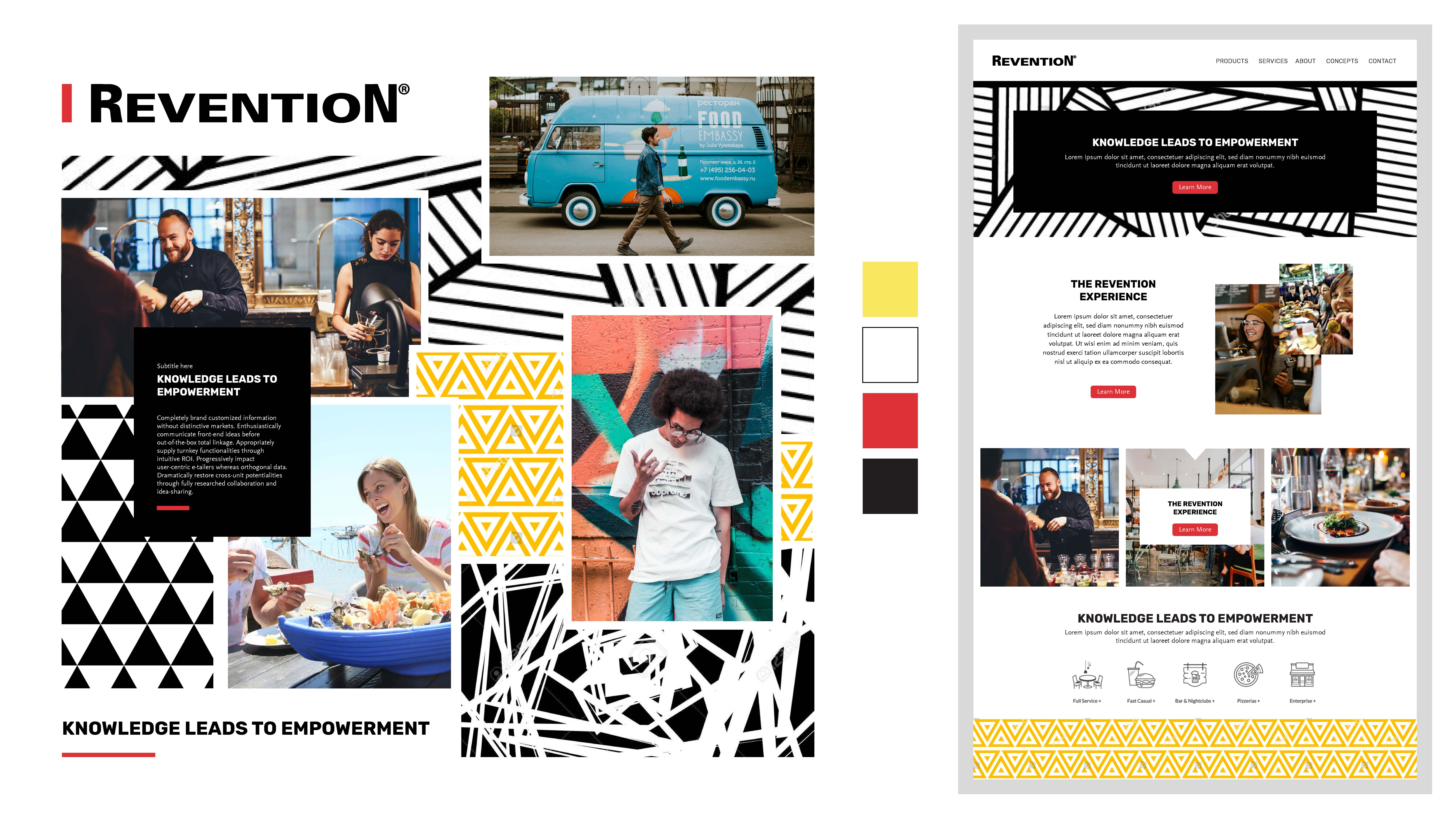
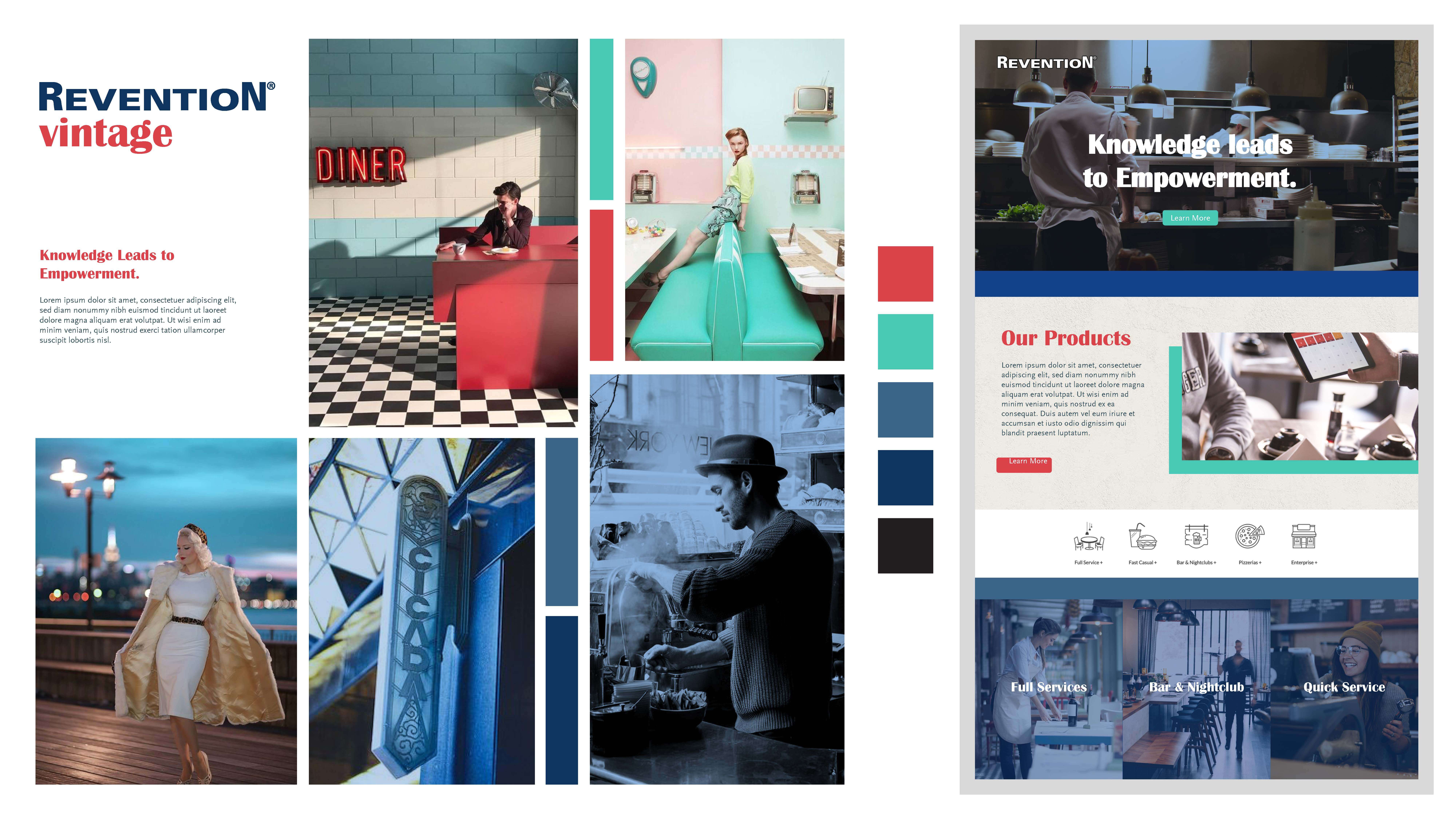
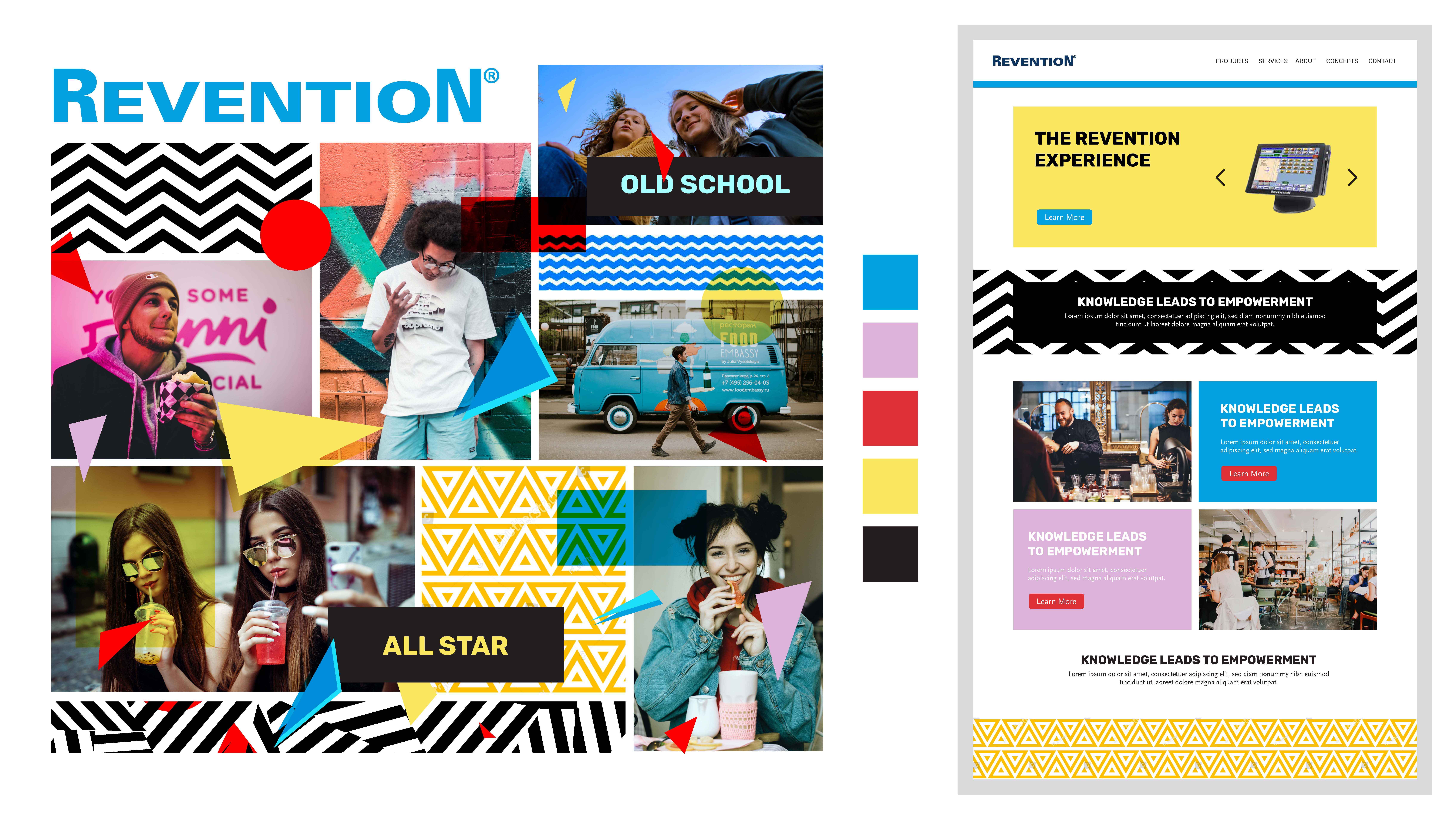
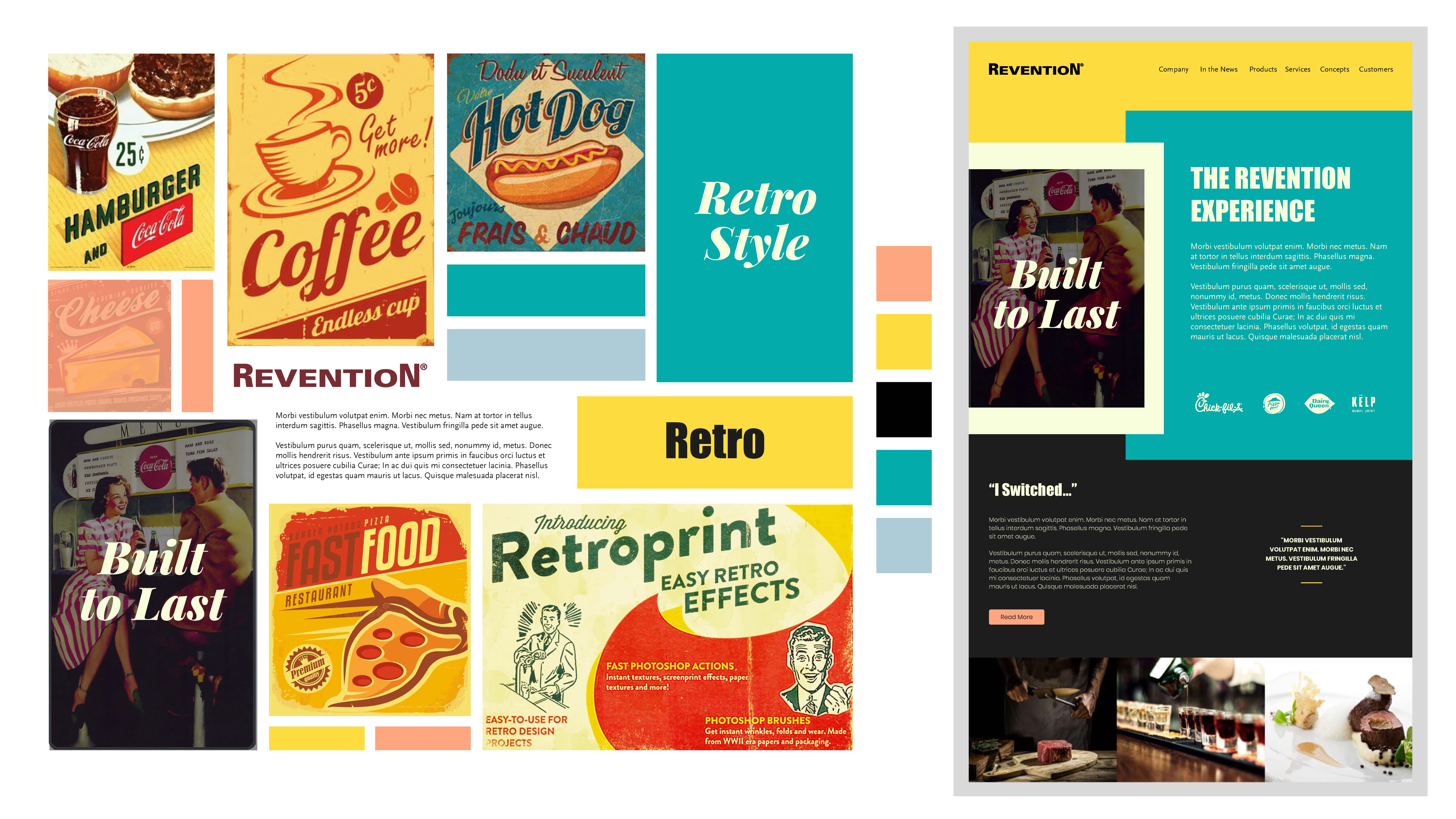
Creating a moodboard is a very efficient way to determine a client’s design perspectives, especially for the situation that a client cannot provide designer his original design desires (which happens very often).
Based on the meeting with Revention team, our team extracted a few keywords like “1950’s Retro”, “Edgy”, “Hipster”. I did a bunch of research and created 4 versions of moodboards indicating four design directions for the client’s selection and feedback. The client picked one version that was close to their expectation with a few feedbacks. Then I made updates to the selected version to a final moodboard, which guided the entire project design process including colour tone and visual feeling.
Mockup
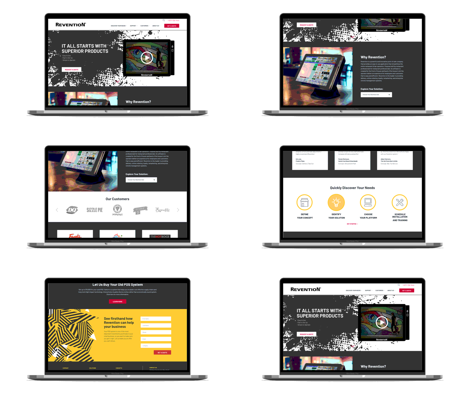
Based on the confirmed wireframe, the mockup of every single page was going to be created. InVision was applied to share the mockups with the client so that they could interact with the pages and leave comments on the design directly. With 10+ versions of updates, the mockup was ready to be implemented in development.
WordPress Development
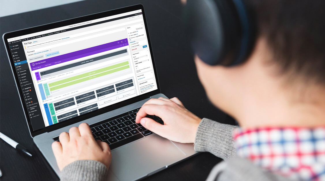
The website was developed on WordPress with Divi custom theme. I developed the site with another team member using Divi builder, combining with custom CSS styling to make the actual site 100% as the mockup that client approved.
